indui on DeviantArthttps://www.deviantart.com/indui/art/Guardians-342642115indui

Deviation Actions

indui's avatar

Guardians

By
Published:
3.3K Views

Description

(Edit: siggy added)

Here to save us from cene 8D

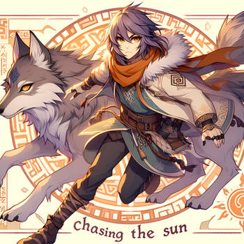
Old old picture finally finished!!!!
ps it's huge (I made it big enough to be a desktop background for my home computer, whose monitor is quite large XD) download if you'd like.
critiques are welcome C: I love getting tips for improvement so don't be shy :XD:

Anna/sin and Indi c) *Indui
Image size
1792x1080px 2.99 MB
© 2012 - 2024 indui
Comments111
Join the community to add your comment. Already a deviant? Log In
zeleftenant's avatar
:star::star::star::star: Overall
:star::star::star::star::star-half: Vision
:star::star::star::star::star-empty: Originality
:star::star::star::star::star-empty: Technique
:star::star::star::star::star-empty: Impact

The amount of energy in this piece really caught me dazzled <img src="e.deviantart.net/emoticons/h/h…" width="15" height="13" alt=":heart:" title="Heart"/> even though there aren't any movement lines in here (as far as my eyes can see) but it looks as if they're moving already, that's where the effects came, it made this piece looks more sparkling. The opposition of the colours are well made and their expressions are so strong that it actually gave as much impact to the viewers for the first time viewing it. However, here's some flaws you can work on; from what I see, it confuses me a little bit of the lighting source, I'm not that sure that it's supposed to be coming from the back or front or in between them (if it's in between that's just seems impossible), I suggest that you make darker areas more darker, not just that, you can always try on the faces too, it doesn't hurt to darken it, you can always undo if you don't like the result, but it would be nice if the areas are darker under their arms and on their (wings?) especially if the light comes from their back. And another thing, the man with red hair, his head proportion looks a bit weird. His hair tied looks too high, but I know it's not something easy to do, you can always practice. I think it would look much more cooler if you put some kind of flare effect in here, but that doesn't seem necessary. Overall in my opinion you have a great skill, just to play around with highlighting and shadows more and minor proportions, the lines are great, the details are amazing, keep up the awesome job <img src="e.deviantart.net/emoticons/h/h…" width="38" height="15" alt=":hug:" title="Hug"/>